


Not all ads are created equal. Some scroll by without a second thought. Others stop you cold. At dozanü, we don’t do beige. We create ads that move people — to feel something, to take action, to remember your name.
So what makes an ad actually work?
Let’s break it down.
A Real Example: Here’s One of Ours
We’ve marked it up to show you exactly how every part was intentionally crafted — from copy to color, from strategy to accessibility.
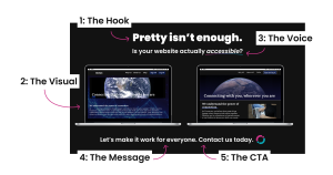
The Hook — Stop the Scroll
People don’t read ads. They scan them. You’ve got 1.5 seconds to matter — and your headline has to do all the heavy lifting.
What works:
- A bold, surprising headline
- A question that hits a nerve
- A visual that’s impossible to ignore
Accessibility Factor: We use high contrast text, clean sans-serif fonts, and large type — no squinting, no deciphering swirly scripts.
2. The Visual — Show Emotion, Not Just Aesthetic
We choose visuals that spark curiosity and resonate with our audience’s lived experiences. Stock photos won’t cut it. Pro tip: The right voice makes even a simple message unforgettable.
Accessibility Factor: All visuals come with alt text. We test color contrast and avoid overly busy backgrounds that compete with text.
3. The Voice: Brand-Forward, Audience-First
We don’t write “captions.” We write connection points. Everything in your brand voice, always thinking about the reader first.
Accessibility Factor: We stick with plain language principles — short sentences, no insider jargon, and intentional tone for inclusivity.
4. The Message — Be Clear, Not Clever
People aren’t playing guessing games with your ad. Be obvious. Be generous. Be useful.
Effective ads:
- Speak to one real person
- Offer one core benefit
- Keep it tight. No essays, no jargon.
5. The CTA — Tell Them What to Do
Every ad should guide the next move. A CTA isn’t a suggestion — it’s an invitation. Don’t be shy, tell them what you want!
Your call to action (CTA) should be:
- Actionable (“Book your session” > “Learn more”)
- Specific (“Grab your 20% code” > “Check this out”)
- Urgent (“Limited spots” > “Whenever you’re ready”)
Accessibility Factor: We follow WCAG standards for button size, spacing, and contrast so that calls to action are easy to find and easy to use.
6. The Strategy — Ads Aren’t Accidents
Behind every ad we run, there’s data: who it’s for, when it runs, what message converts. We A/B test. We segment. We learn and adapt.
If it’s not rooted in strategy, it’s just noise.
Behind every great ad:
- Real research
- Audience segmentation
- A/B testing and learning
Why Accessibility Isn’t Optional
If your ad isn’t accessible, it’s not reaching everyone who could love your brand. Period. We design ads that invite everyone in — from visual accessibility to inclusive messaging. Because access is the strategy.
So, What’s the Anatomy of Your Ad?
Whether you’re launching a new campaign or trying to figure out why your last one flopped — knowing what makes an ad click is the first step.
Ready to make ads people actually want to click?
Let’s build your next high-performing campaign.
Image Description: The image has a black background and features two laptops side-by-side to illustrate their differences in website accessibility. Each element is labeled using white text boxes and curved magenta arrows: 1. The Hook – An arrow points to the bold headline at the top that says, “Pretty isn’t enough.” 2. The Visual – An arrow points to the laptop screens. 3. The Voice – An arrow points to the subheading beneath the headline that reads, “Is your website actually accessible?” 4. The Message – Positioned beneath both laptops, the text reads: “Let’s make it work for everyone.” 5. The CTA (Call to Action) – Refers to the next sentence: “Contact us today.” followed by the dozanü icon.